
Do Democracies Produce Our World’s Smartest Students?
An interactive data visualization created in Tableau

BRIEF
“Create a Tableau story about a topic of your choice.”
CONTEXT | A project for “Intro to Infographics and Data Visualization” class during the first semester of University of Miami’s Interactive Media graduate program.
ROLE | Designer
TIMELINE | 1 Week
INSPIRATION | “The Best Stats You’ve Ever Seen” Ted Talk by Hans Rosling
EXPLORING A STORY
As a former teacher and educator, I’m intrigued by data sets that could provide insight on the factors that impact a student’s academic achievement as well as how academic achievement impacts other aspects of a student’s life. Additionally, inspired by Hans Rosling’s work and his ability to show trends and tell a story about a country’s GDP or rise in life expectancy over time, I wanted to explore big data sets that included multiple countries and answered questions that people are often curious about. As political polarization has become more pronounced in the world’s democracies throughout the last few years, I thought that data that explored tenets of democracy would be relevant to analyze as well. I wanted to tell a story that would be accessible to a general audience and provide some surprising insights.


An article from The Washington Post
DIGGING IN DEEPER
In searching for clean and easy to use data sets, I came across the Economist Intelligence Unit’s Democracy Index that ranks countries into four categories based on to what extent the country’s government exhibits democratic practices. The four categories are Full Democracies, Flawed Democracies, Hybrid Regimes, and Authoritarian Regimes. I was also intrigued by Programme for International Student Assessment (PISA) that measures 15-year-old students’ reading, math, and science understanding in countries across the world.


By looking through the data, I determined that I had enough information to explore the following questions:
How does a country’s Democratic Index and PISA score correlate?
How do boys and girls score differently on the PISA? How might this be impacted by their country’s Democracy Index?
How do countries score on the PISA over time? How might this correlate to their democratic index?
As a new Tableau user aiming to provide a clear and easy-to-manipulate story for an audience, I decided to dig into the first question, “How does a country’s Democratic Index and PISA score correlate?” I found that just by analyzing the most recent year that PISA was conducted (2018), I could already see unexpected surprises in the data by averaging the reading, math, and science scores to get one average and compare countries across the board.
Next, I pulled the Economist Intelligence Unit’s Democracy Index from 2018 so that data sets could be compared from the same year. As an educator, I would often hear that Scandinavian countries have superior education systems to the United States and they are often also lauded for their public institutions such as health care. Prior to pulling the data, I had a hypothesis that perhaps Norway, Sweden, Finland, Iceland and Denmark would score the highest on both the Democracy Index and PISA, and I was excited to see what nuances I might find.
ANALYZING DATA IN TABLEAU
I dragged the following two spreadsheets into Tableau:
Democracy Index 2018: Containing country names and their government type (Full Democracy, Flawed Democracy, Hybrid Regime, Authoritarian)
PISA 2018: Containing each tested country’s math, reading, and science average

I was able to see right away that China as an Authoritarian nation had the highest combined average on the PISA. Another surprising insight – Thailand as a Hybrid Regime had a higher average score than Norway. Another jolt to reality, but perhaps not a surprise, was that the United States was labeled a Flawed Democracy in 2018, while our neighbor, Canada retains Full Democracy status.
PLANNING MY TABLEAU STORY
After experimenting with Tableau to see what was possible to create on a dashboard, I determined that my story would best be shown by using a combination of bar graphs and maps that could be filtered by country and Government Type categories so that a curious user could see correlation between Government Type and PISA scores.
I determined that my story would include 4 dashboards:
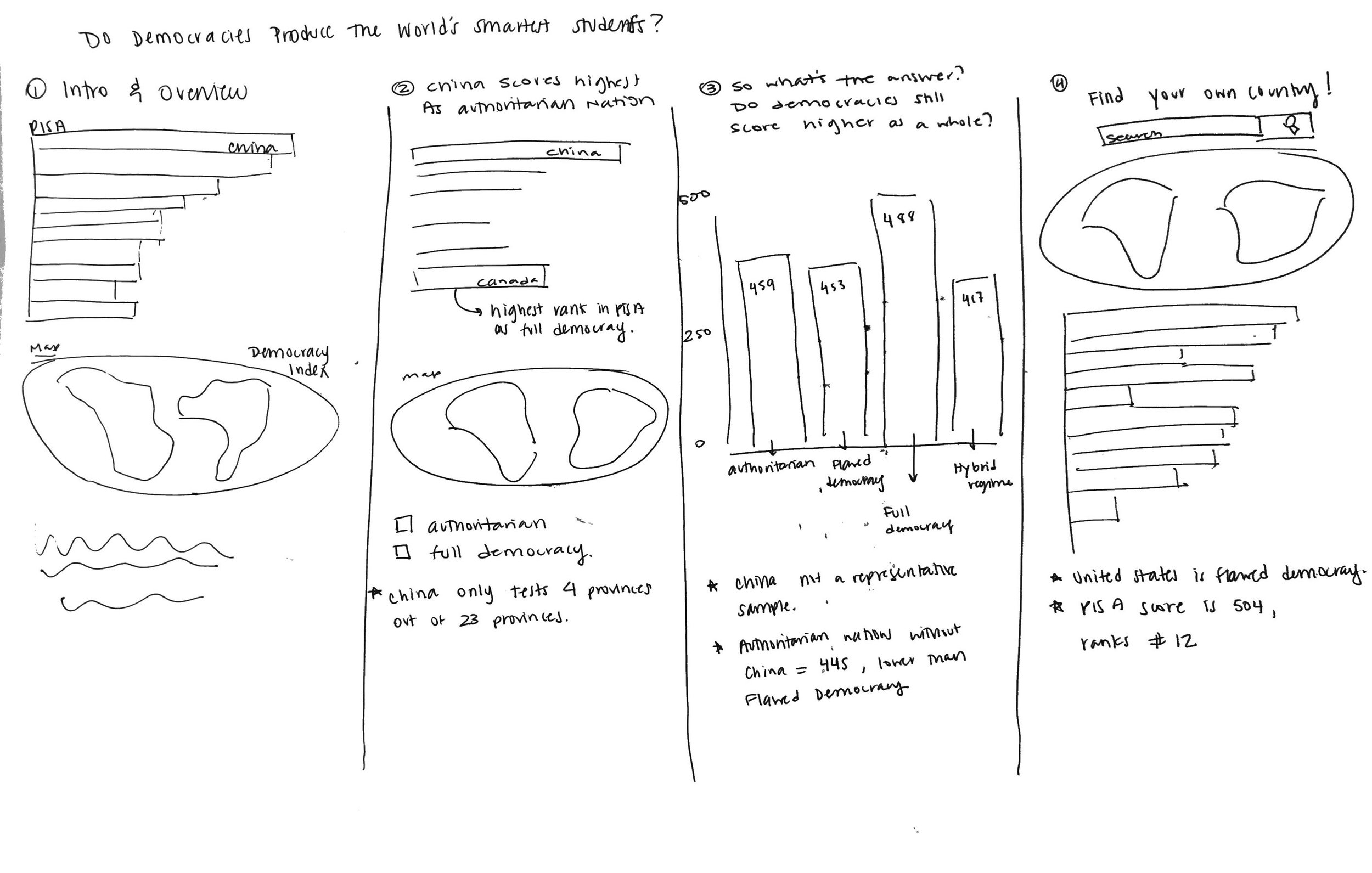
Intro and Overview: this would show the broad overall data of countries ranked by PISA score and coded by color to show if they were a Full Democracy, Flawed Democracy, Hybrid Regime, or Authoritarian.
China scores highest as an Authoritarian country: In digging into the data, I realized that China’s PISA data was specifically named B-S-J-Z to specify that only four provinces (Beijing, Shanghai, Jiangsu, and Zhejiang) were tested. This meant that China’s data is not representative of the whole country.
What’s the answer? Do Democracies score the highest?: In averaging the scores for each Government Type, Full Democracies did have the highest PISA average. Authoritarian countries scored the second highest. However, remove China from that average and Flawed Democracies would score higher.
Find your country: For the last dashboard, I wanted the user to be able to search for a country of their choice and see where it landed as far as PISA rankings and Government Type in comparison to other countries.
DASHBOARD 1
This dashboard provides an introduction to the story as well as an overview of the data. A user can click on the Government Type key to highlight countries by government type both on the bar chart and on the map.


DASHBOARD 2
This dashboard is filtered to highlight the difference in PISA scores between China, an Authoritarian country and Canada, the highest scoring Full Democracy.

DASHBOARD 3
In this dashboard, a bar chart ranking countries by PISA scores is accompanied by another bar chart showing the PISA score average by Government Type. In this dashboard, I wanted to hit the key point that Full Democracies do score the highest on the PISA by group average. Even though Authoritarian countries come in second, their average is bolstered by China’s score, a country who is not testing a representative sample of their population.

DASHBOARD 4
This dashboard provides a few unexpected facts about the PISA scores of countries such as Thailand and the United Kingdom. It also allows the user to use a search bar to search for a country of their choice and interact with the map and bar chart to compare their country to others.


REFLECTION
“Play” with data, but don’t get carried away. In determining how I would compare PISA data and Democracy Index data, I found that there were several ways I could analyze each data set separately and together to answer different questions and come up with new insights. I could have looked at multiple countries’ PISA data over time, Democracy Index data over time, as well as both of them side by side. I began to see that it would be easy to get carried away filtering and trying out different combinations of data sets, leading me to impose a hard deadline for myself by when I would need to choose the data I was going to use. This allowed me to spend 20% of the time allotted to the project choosing the data and 80% of my time creating the visualization.
Determine the key points of your story before creating. After analyzing the data, I wanted to be sure that I knew what story points I wanted to convey so that I wouldn’t waste time creating multiple dashboards that didn’t fit. I typed out my copy first so that I knew where the story was going and then chose which maps and graphs to highlight.
Don’t underestimate the power of YouTube. Any time I wasn’t quite sure how to manipulate something or move forward, there was always a YouTube video to help me. Even though I sometimes felt reluctant to click on them because I thought it would “waste time,” it was consistently the best help I could get in the moment.